Task Description
This exercise requires us to apply the skills you had learned in Lesson 1 and Hands-on Exercise 1 to reveal the demographic of the city of Engagement, Ohio USA by using appropriate static statistical graphics methods. The data should be processed by using appropriate tidyverse family of packages and the statistical graphics must be prepared using ggplot2 and its extensions.
Check packages
packages = c('tidyverse', 'ggplot2', 'dplyr')

for(p in packages) {
  if(!require(p, character.only = T)) {
    install.packages(p)
  }
  library(p, character.only = T)
}
Load Data
Rows: 1,011
Columns: 7
$ participantId  <dbl> 0, 1, 2, 3, 4, 5, 6, 7, 8, 9, 10, 11, 12, 13,…
$ householdSize  <dbl> 3, 3, 3, 3, 3, 3, 3, 3, 3, 3, 3, 3, 3, 3, 3, …
$ haveKids       <lgl> TRUE, TRUE, TRUE, TRUE, TRUE, TRUE, TRUE, TRU…
$ age            <dbl> 36, 25, 35, 21, 43, 32, 26, 27, 20, 35, 48, 2…
$ educationLevel <chr> "HighSchoolOrCollege", "HighSchoolOrCollege",…
$ interestGroup  <chr> "H", "B", "A", "I", "H", "D", "I", "A", "G", …
$ joviality      <dbl> 0.001626703, 0.328086500, 0.393469590, 0.1380…
Graphics with ggplot2
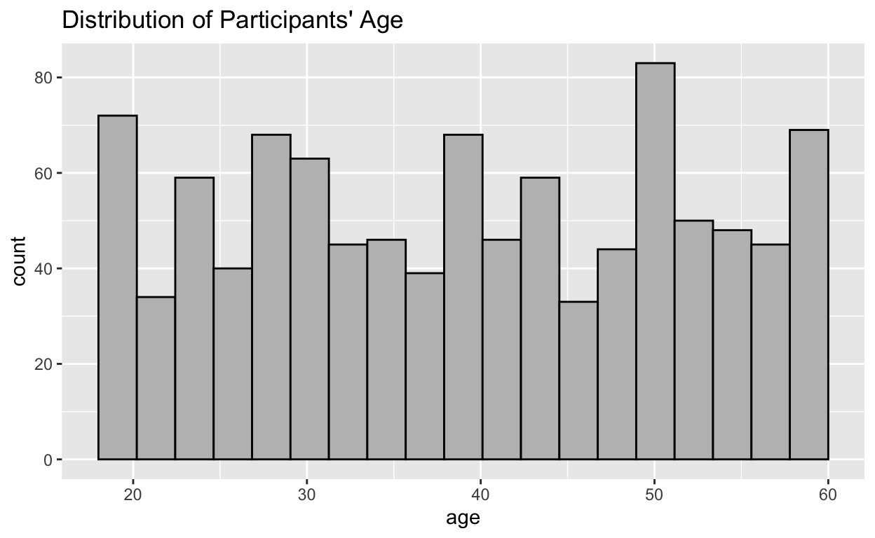
Now we can dive into the age atribute:
ggplot(data=data) + aes(x=age) +
  geom_histogram(bins=20, boundary=60, color="black", fill="grey") +
  ggtitle("Distribution of Participants' Age")
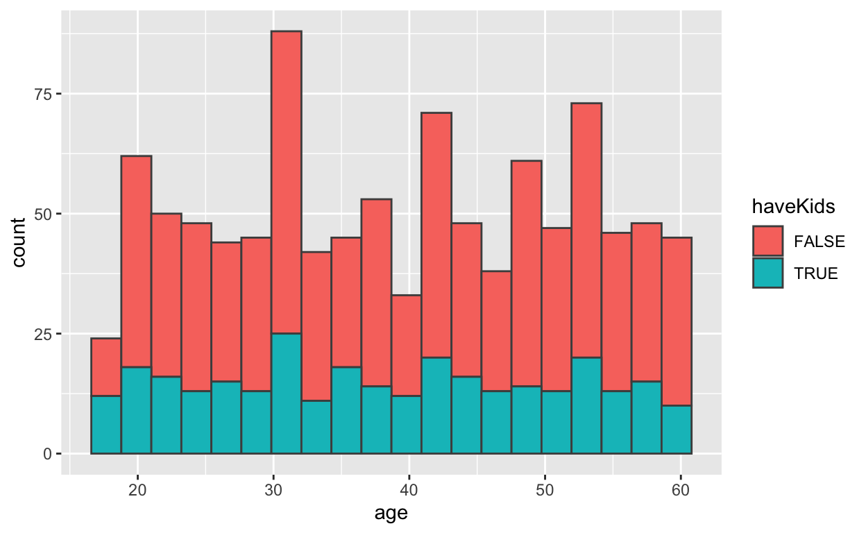
ggplot(data=data, aes(x=age, fill=haveKids)) +
  geom_histogram(bins=20, color='gray30')
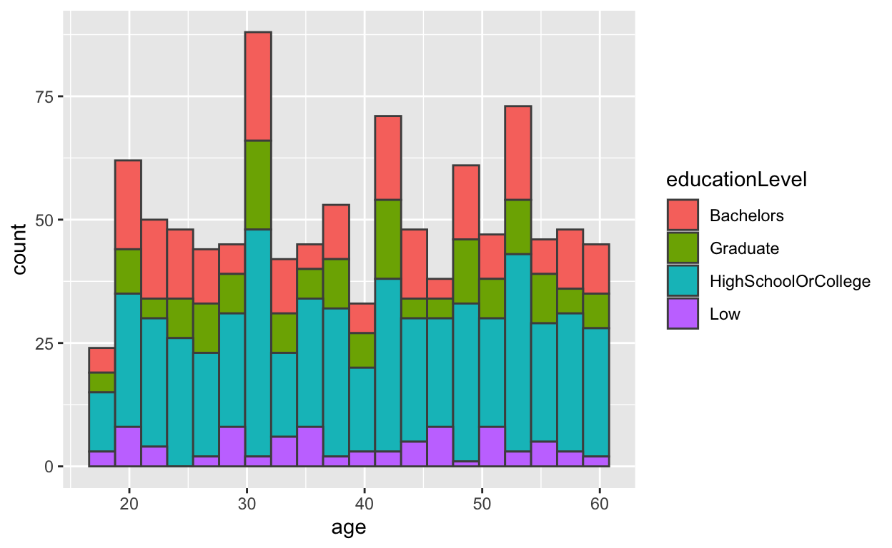
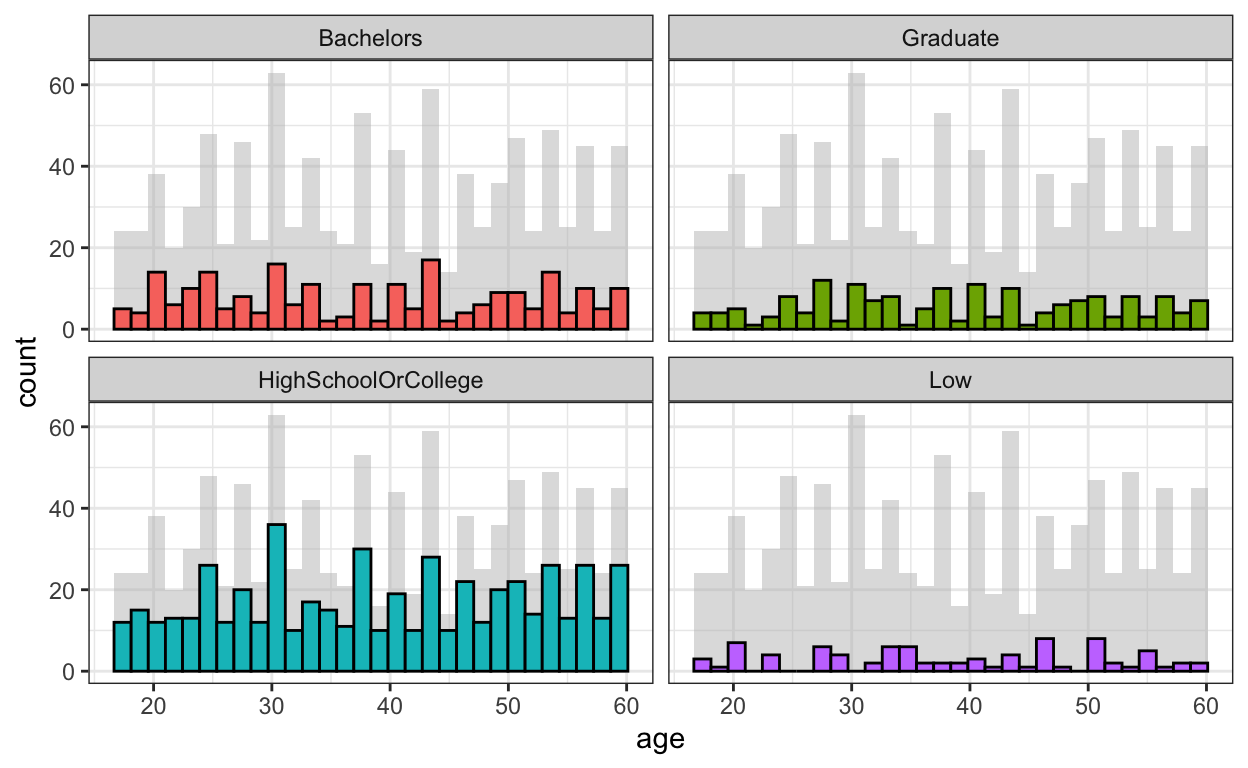
ggplot(data=data, aes(x=age, fill=educationLevel)) +
  geom_histogram(bins=20, color='gray30')
d <- data
d_bg <- d[, -5]
ggplot(d, aes(x = age, fill = educationLevel)) +
  geom_histogram(data=d_bg, fill="grey", alpha=.5) +
  geom_histogram(colour="black") +
  facet_wrap(~ educationLevel) +
  guides(fill = FALSE) +
  theme_bw()
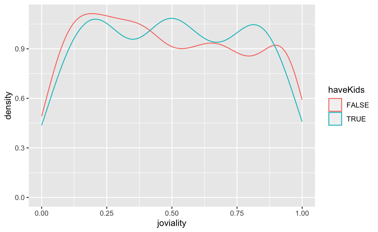
To see more about joviality:
ggplot(data=data, aes(x = joviality, colour=haveKids)) + geom_density()
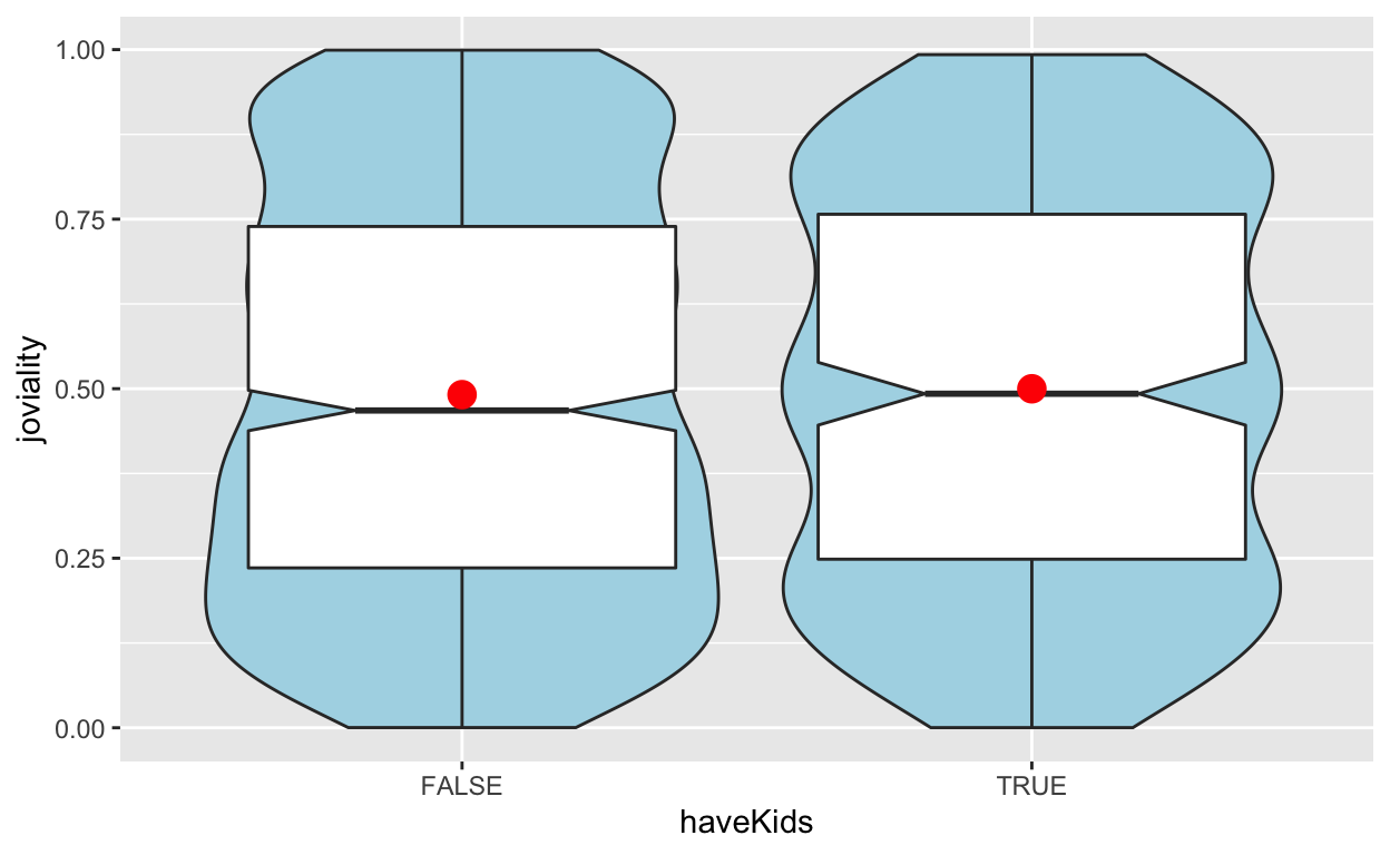
ggplot(data=data, aes(y = joviality, x= haveKids)) +
  geom_violin(fill='light blue') +
  geom_boxplot(notch=TRUE) +
  stat_summary(geom = "point", fun="mean", colour ="red", size=4)
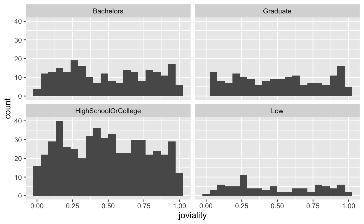
ggplot(data=data, aes(x= joviality)) + geom_histogram(bins=20) +
  facet_wrap(~ educationLevel)
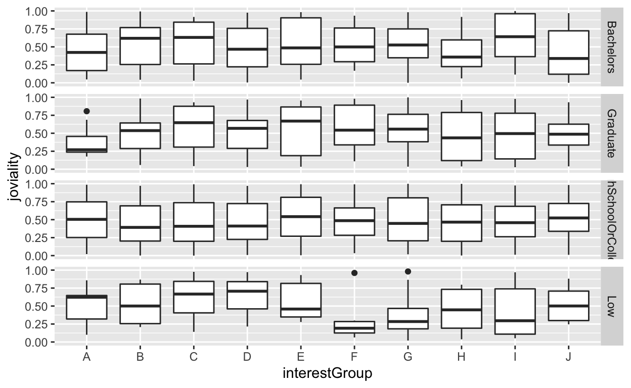
ggplot(data=data, aes(y = joviality, x= interestGroup)) + geom_boxplot() +
  facet_grid(educationLevel ~.)
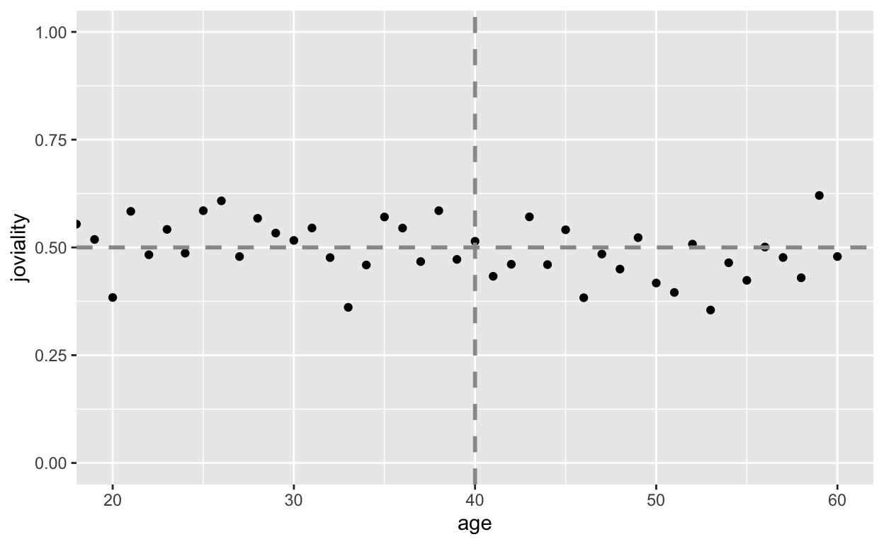
dpp <- data %>%
  group_by(age) %>%
  summarise(joviality = mean(joviality))
ggplot(data=dpp, aes(x=age, y=joviality)) + geom_point() +
  coord_cartesian(xlim=c(20, 60), ylim=c(0, 1)) +
  geom_hline(yintercept=0.5, linetype="dashed", color="grey60", size=1) +
  geom_vline(xintercept=40, linetype="dashed", color="grey60", size=1)
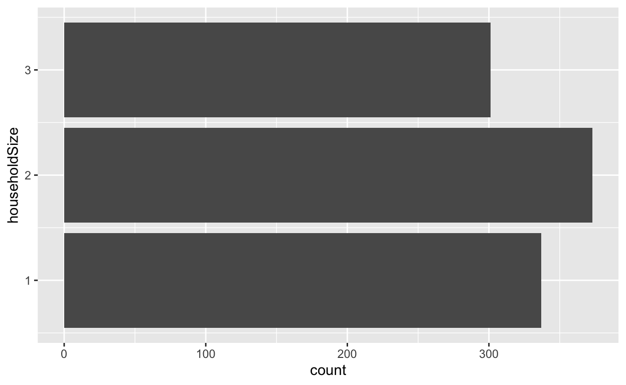
Now, we can just find out the counts of householdSize types:
ggplot(data=data, aes(x=householdSize)) + geom_bar() + coord_flip()