Task Description
In this take-home exercise, you are required to:
- select one of the Take-home Exercise 1 prepared by your classmate,
- critic the submission in terms of clarity and aesthetics, and remake the original design by using the data visualisation principles and best practice you had learned in Lesson.
Load data
packages = c('tidyverse', 'ggdist', 'ggridges',
             'patchwork', 'ggthemes', 'hrbrthemes',
             'ggrepel', 'ggforce')

for(p in packages) {
  if(!require(p, character.only = T)) {
    install.packages(p)
  }
  library(p, character.only = T)
}
participants_data <- read_csv('data/Participants.csv')
I choose Huang Anni’s exercise 1 to do this exercise 2.
Charts to Modify
The previous first charts is:
participants_data$age_state = ifelse(
    test = participants_data$age > 30,
    yes = "Old",
    no = "Young"
)
# Make it a factor
participants_data$age_state = factor(
    participants_data$age_state,
    levels = c("Old", "Young")
)
p1 = ggplot(data=subset(participants_data,age_state=='Young'),
       aes(x = joviality)) +
  geom_density() +
  ggtitle("Distribution of joviality for young people")+
  theme(plot.title = element_text(size = 10))
p2 = ggplot(data=subset(participants_data,age_state=='Old'),
       aes(x = joviality)) +
  geom_density() +
  ggtitle("Distribution of joviality for old people")+
  theme(plot.title = element_text(size = 10))
p3 = ggplot(data=participants_data,
aes(x= joviality,
fill = age_state)) +
geom_density(alpha=0.2) +
  annotate("text", x = 0.7, y = 1.2, label = "Young people tend\n to be happier",size=3,color='#4682B4') +
  ggtitle("Distribution of joviality in different Age Groups")+
  theme(plot.title = element_text(size = 10))
(p1 / p2) | (p3+
  scale_y_continuous(name="density", limits=c(0.0, 1.2)))
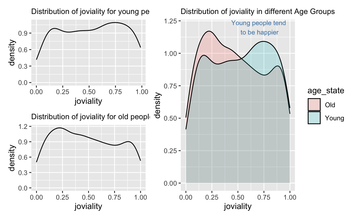
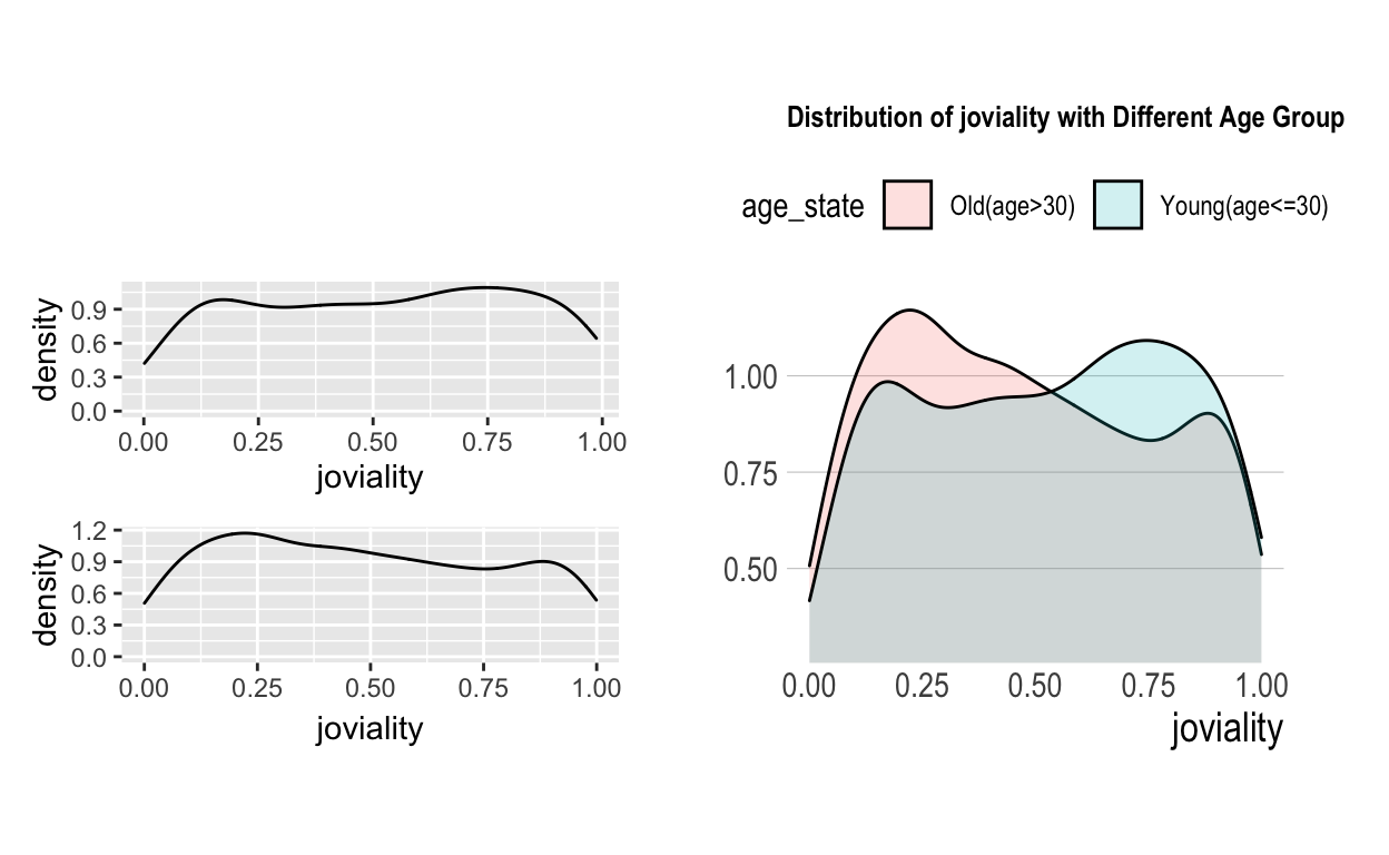
The left part’s meaning is the same as the right one, both want to compare the joviality of different age groups, but we need to show what is the meaning of old and young. Also, the titles in the left part is redundant, so we need to eliminate them. hence we just simplify this graph
participants_data$age_state = ifelse(
    test = participants_data$age > 30,
    yes = "Old(age>30)",
    no = "Young(age<=30)"
)
# Make it a factor
participants_data$age_state = factor(
    participants_data$age_state,
    levels = c("Old(age>30)", "Young(age<=30)")
)
p1 = ggplot(data=subset(participants_data,age_state=='Young(age<=30)'),
       aes(x = joviality)) +
  geom_density() +
  theme(plot.title = element_text(size = 10))
p2 = ggplot(data=subset(participants_data,age_state=='Old(age>30)'),
       aes(x = joviality)) +
  geom_density() +
  theme(plot.title = element_text(size = 10))
p3 = ggplot(data=participants_data,
aes(x= joviality,
fill = age_state)) +
geom_density(alpha=0.2) + coord_cartesian(ylim = c(0.3, 1.2)) +
  ggtitle("Distribution of joviality with Different Age Group") +
  theme_ipsum(grid = "Y", axis_title_size = 14) +
  theme(plot.title = element_text(size = 10),
        axis.title.y = element_blank(), legend.position = "top")
(p1 / p2) | (p3+
  scale_y_continuous(name="density", limits=c(0.0, 1.2)))
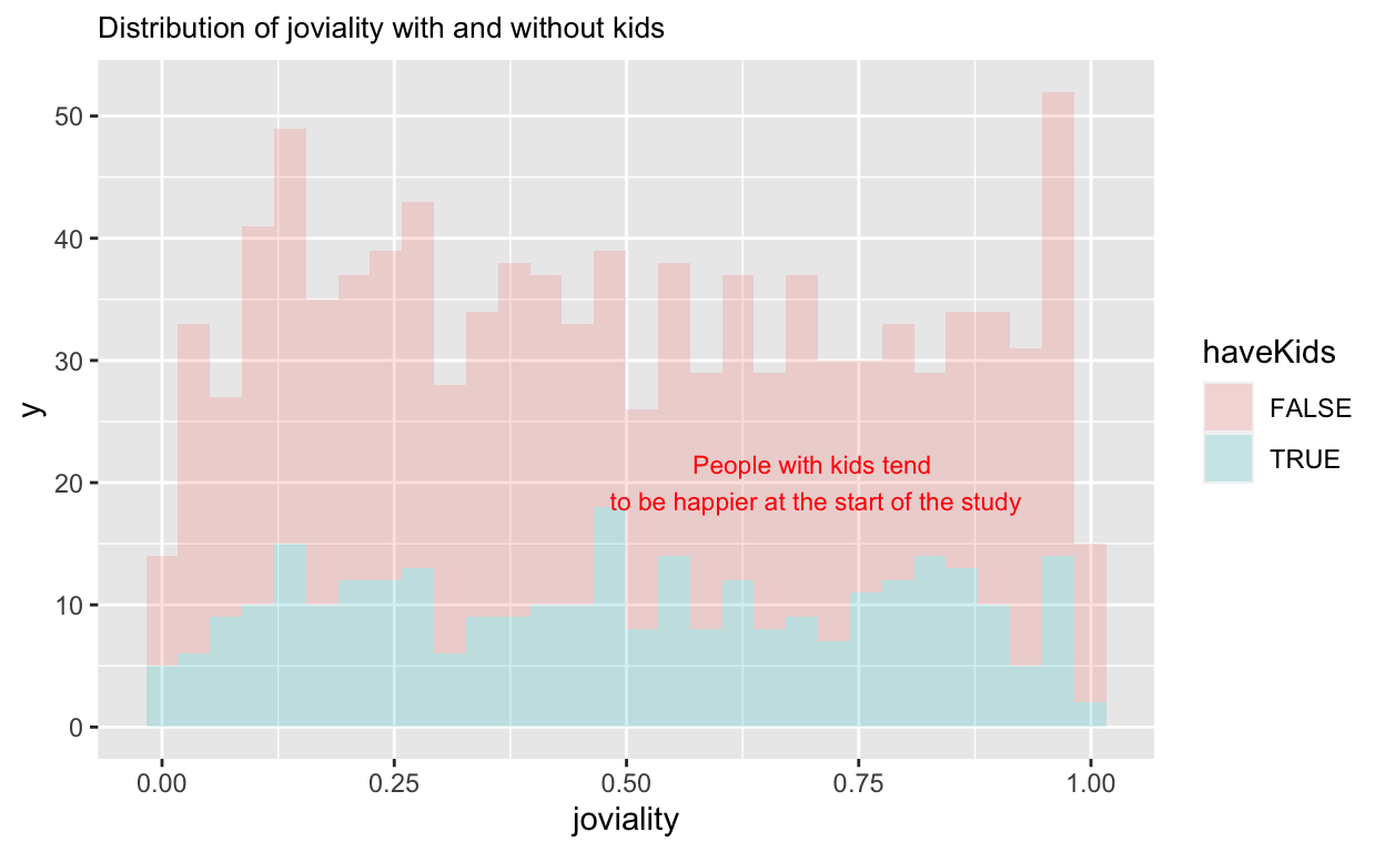
For the second chart
ggplot(data=participants_data,
aes(x= joviality,
fill = haveKids)) +
geom_histogram(alpha=0.2) +
  annotate("text", x = 0.7, y = 20, label = "People with kids tend\n to be happier at the start of the study",size=3,color='red') +
  ggtitle("Distribution of joviality with and without kids")+
  theme(plot.title = element_text(size = 10))
agg_happy <- participants_data %>%
  select(c("householdSize","joviality")) %>%
  group_by(householdSize) %>%
  summarise(joviality=mean(joviality))

happy_sorted <- agg_happy %>%
  arrange(desc(householdSize))
ggplot(data=happy_sorted,
aes(y = joviality,
x= householdSize)) +
geom_line(linetype = "dashed",color='black',arrow = arrow(type = "closed"))+
  geom_point(stat = "identity",
             position = "identity")+
  ggtitle("Change of average joviality when householdSize increase")+
  annotate("text",
           x = 2.5,
           y = 0.495,
           label = "People tend \n to be happier\n at the start of study with\n larger householdSize",size=3,color='#4682B4') +
  theme(plot.title = element_text(size = 12))
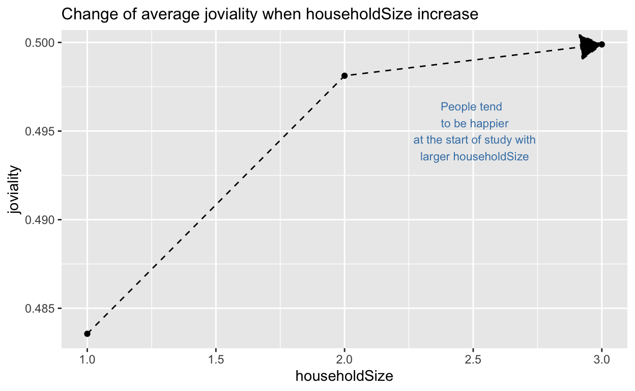
The expression is correct, but the color is not very fashion and it should not use opacity too much; The comparison of household contains only 3 groups, so it should not use line plot. Instead, barplot is a good alternative. So to modify it, we change it to:
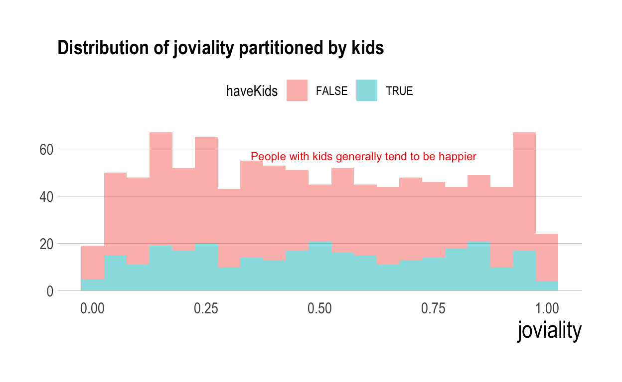
ggplot(data=participants_data,
aes(x= joviality, fill = haveKids)) +
geom_histogram(binwidth = 0.05, alpha=0.5) +
  annotate("text", x = 0.6, y = 57, label = "People with kids generally tend to be happier ",size=3,color='red') +
  ggtitle("Distribution of joviality partitioned by kids")+
  theme_ipsum(grid = "Y", axis_title_size = 18) +
  theme(plot.title = element_text(size = 15), axis.title.y = element_blank(), legend.position = "top")
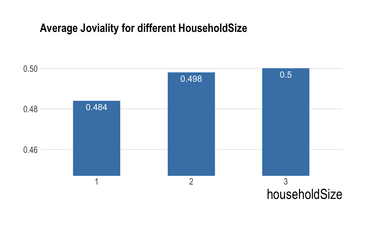
agg_happy <- participants_data %>%
  select(c("householdSize","joviality")) %>%
  group_by(householdSize) %>%
  summarise(joviality=mean(joviality))
agg_happy$joviality <- round(agg_happy$joviality, 3)

ggplot(data=agg_happy, aes(x=householdSize, y=joviality)) +
  geom_bar(stat = "identity", width = 0.5, fill="steelblue") +
  coord_cartesian(ylim = c(0.45, 0.51)) +
  ggtitle("Average Joviality for different HouseholdSize") +
  scale_x_discrete(name ="householdSize", limits=c("1","2","3")) +
  geom_text(aes(label = joviality), vjust = 1.5, colour = "white")+
  theme_ipsum(grid = "Y", axis_title_size = 18) +
  theme(plot.title = element_text(size = 15), axis.title.y = element_blank())
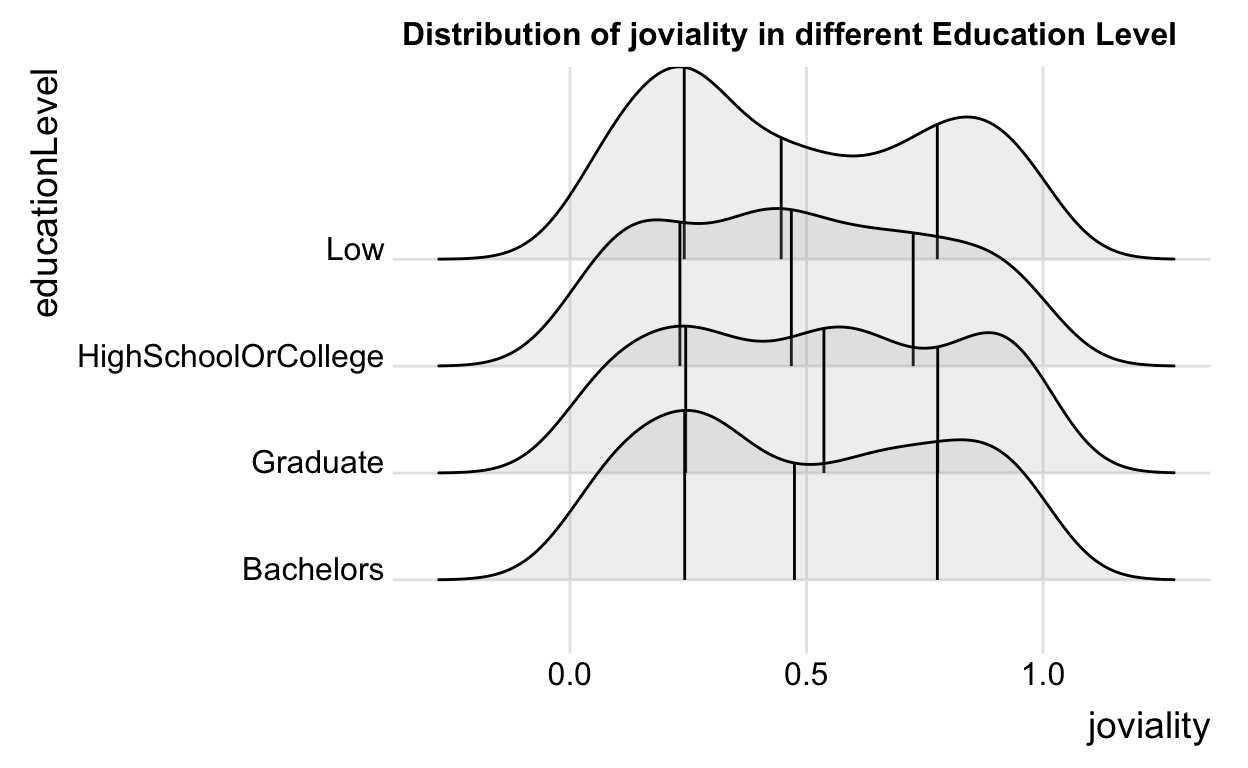
For the third chart,
ggplot(participants_data, aes(x = joviality, y = educationLevel, fill = educationLevel)) +
  geom_density_ridges(geom = "density_ridges_gradient",
                      calc_ecdf = TRUE,
                      quantiles = 4,
                      quantile_lines = TRUE,
                      alpha = .2) +
  theme_ridges() +
  scale_fill_viridis_d(name = "Quartiles")+
  ggtitle("Distribution of joviality in different Education Level")+
  theme(plot.title = element_text(size = 12))
the expression is correct, but the legend takes almost half of the plot, which is not very reasonable. Also,we need to avoid using multiple colours if the y-axis label already clearly indicate the education level and edit the axis label properly.. So I just simply modify it by:
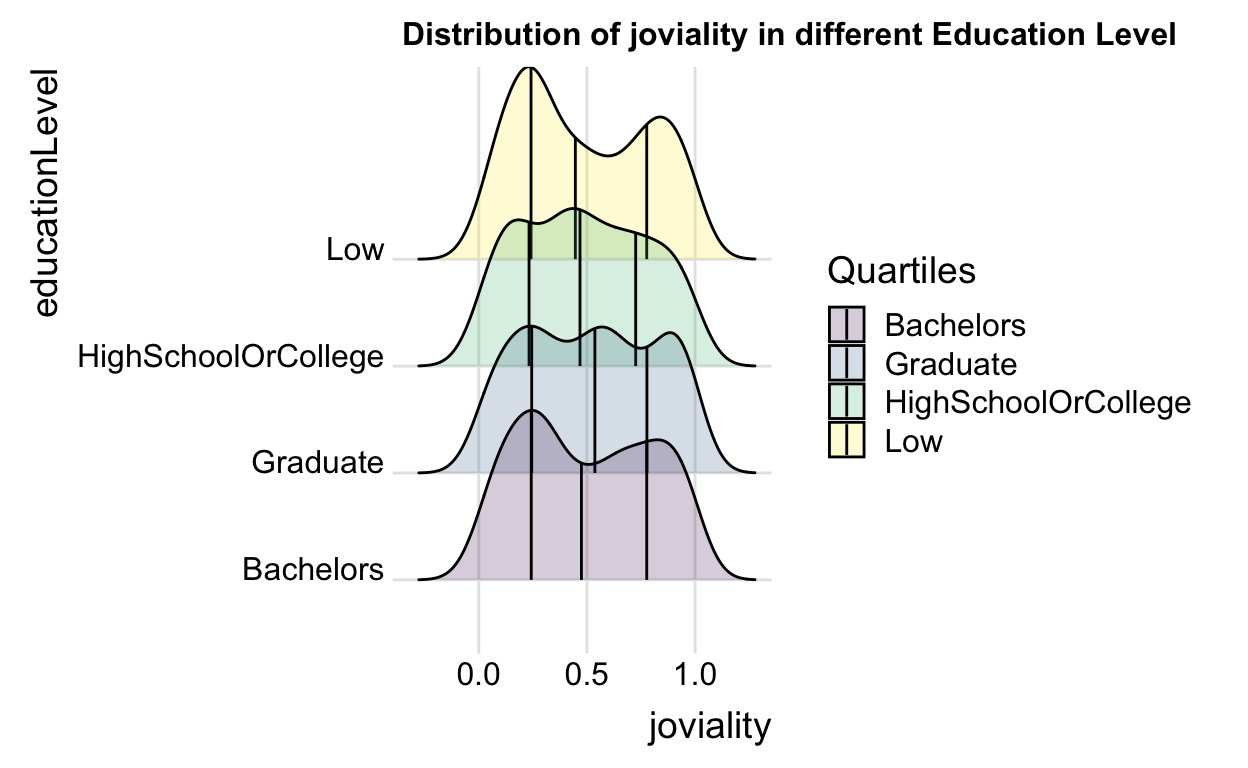
ggplot(participants_data, aes(x = joviality, y = educationLevel)) +
  geom_density_ridges(geom = "density_ridges_gradient",
                      calc_ecdf = TRUE,
                      quantiles = 4,
                      quantile_lines = TRUE,
                      alpha = .2) +
  theme_ridges() +
  scale_fill_viridis_d(name = "Quartiles")+
  ggtitle("Distribution of joviality in different Education Level")+
  theme(plot.title = element_text(size = 12), legend.position = "top")