Task Description
Over time, are businesses growing or shrinking? How are people changing jobs? Are standards of living improving or declining over time?
How does the financial health of the residents change over the period covered by the dataset? How do wages compare to the overall cost of living in Engagement? Are there groups that appear to exhibit similar patterns? Describe your rationale for your answers. Limit your response to 10 images and 500 words.
Load Packages
packages = c('ggiraph', 'plotly', 'DT', 'patchwork', 'gganimate', 'tidyverse',
             'readxl', 'gifski', 'gapminder', 'tidyverse', 'rmarkdown',
             'ggdist', 'ggridges', 'patchwork', 'ggthemes', 'hrbrthemes','ggrepel',
             'ggforce')
for (p in packages){
  if(!require(p, character.only = T)){
    install.packages(p)
  }
  library(p,character.only = T) }
financial <- read_csv('data/Journals/FinancialJournal.csv')
participants <- read_csv('data/Attributes/Participants.csv')
paged_table(financial)
Ways to Measure Financial Health
Payment-to-Income Ratio
To measure the residents’ financial health, we need to calculate the average level of different metrics. This ratio metric indicates the proportion of expense a citizen spend on different engagements. Generaly, if people lack money, they tend to save money to the bank instead of consuming.
y <- as.POSIXct(financial$timestamp, format="%Y-%m-%d %H:%M:%S")
financial$year <- format(y, format="%Y")
financial$month <- format(y, format="%m")

income <- financial %>%
  filter(category %in% c('Wage', 'RentAdjustment')) %>%
  group_by(year, month) %>%
  summarise(income = mean(amount))

outcome <- financial %>%
  filter(!category %in% c('Wage', 'RentAdjustment')) %>%
  group_by(year, month) %>%
  summarise(outcome = mean(abs(amount)))

total <- merge(income, outcome, by=c('year', 'month'))
total$coef <- total$outcome / total$income
total$date <- paste(total$year, total$month, sep='-')
plot_ly(total, x = ~date, y = ~coef, type = 'scatter',mode = 'lines+markers') %>%
  layout(title="Trend of Living Standards",
        xaxis = list(title = "Date"),
        yaxis = list (title = "Coefficient\n(outcome/income)"))
During the given period, this ratio is stable and increase as a whole, so we conclude that the financial health of the residents should be healthy.
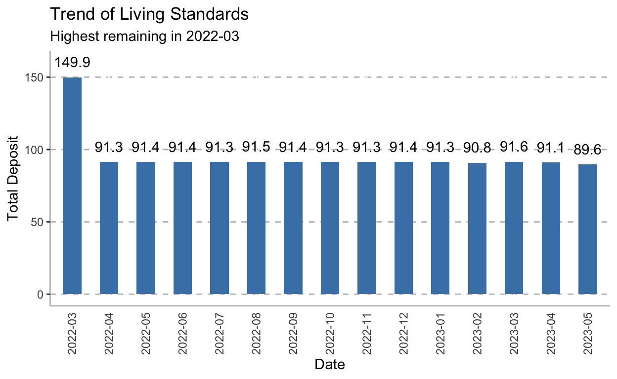
Net Worth
Net worth is the value of all the income assets minus all the liabilities. This is one of my favorite financial items to track. To measure the residents’ financial health, we need to calculate the average net worth for each month and draw a plot to see the trend. If every month the net worth is great than 0 or just stay stability, it means the financial health is good.
total$remain <- (total$income - total$outcome)
total$remain <- round(total$remain, 1)
ggplot(data=total, aes(x=date, y=remain)) +
  geom_bar(stat = "identity", width = 0.5, fill="steelblue") +
  coord_cartesian(ylim = c(0, 160)) +
  labs(y= 'Total Deposit', x= 'Date',
       title = "Trend of Living Standards",
       subtitle = "Highest remaining in 2022-03") +
  geom_text(aes(label = remain), vjust = -1, colour = "black") +
  theme(axis.title.y= element_text(angle=90),
        axis.text.x = element_text(angle = 90, hjust = 1, vjust = 0.5),
        axis.ticks.x= element_blank(),
        panel.background= element_blank(),
        axis.line= element_line(color= 'grey'),
        panel.grid.major.y = element_line(color = "grey",size = 0.5,linetype = 2))
Income
For each participant, we can evaluate wage as the source of income. Since income is a intuitive way to show the cash flow and inspect the health of finance. We then just draw the distribution of the participants’ wage and split the wage into 5 bins to indicate different group of people. We will then explore the data by this grouping method and try to find some similar patterns among these groups.
wage <- financial %>%
  filter(category == 'Wage') %>%
  group_by(participantId) %>%
  summarise(wage = mean(amount))
brks <- c(0, 100, 200, 300, 400, Inf)
grps <- c('<=100', '101-200', '201-300', '301-400', '>400')
wage$Wage_Group <- cut(wage$wage, breaks=brks, labels = grps, right = FALSE)
#plot_ly(wage, x = ~wage, type = "histogram")
p <- ggplot(data=wage, aes(x=wage, fill=Wage_Group)) +
    geom_histogram(aes(y = ..density..)) +
    geom_density(fill="red", alpha = 0.2)

ggplotly(p)
income <- financial %>%
  filter(category %in% c('Wage', 'RentAdjustment')) %>%
  group_by(participantId) %>%
  summarise(income = sum(amount))

outcome <- financial %>%
  filter(!category %in% c('Wage', 'RentAdjustment')) %>%
  group_by(participantId) %>%
  summarise(outcome = sum(abs(amount)))

comparison <- merge(income, outcome, by='participantId') %>%
  merge(wage, by='participantId')
comparison$ratio <- comparison$outcome / comparison$income
ggplot(comparison, aes(x = ratio, y = Wage_Group)) +
  geom_density_ridges(calc_ecdf = TRUE,
                      quantiles = 4,
                      quantile_lines = TRUE,
                      alpha = .2) +
  theme_ridges() +
  scale_fill_viridis_d(name = "Quartiles") +
  ggtitle("Distribution of outcome/income Ratio in Different Wage Group")+
  theme(plot.title = element_text(size = 12), legend.position = "top")
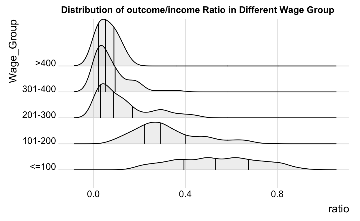
From the above chart, we concluded that the first 2 group(low-income groups) tend to spend most of the money on daily consumption, while the other 3 groups(high-income groups) could save substantial money and save. Combined with previous charts, participants with different incomes distribute uniformly in this data, so we might imply that the consumption views are related to the amount of income.
comparison <- merge(comparison, participants[, c(1,3)], by='participantId')
p1 <- ggplot(comparison, aes(x = ratio, y = haveKids)) +
  geom_density_ridges(calc_ecdf = TRUE,
                      quantiles = 4,
                      quantile_lines = TRUE,
                      alpha = .2) +
  theme_ridges() +
  scale_fill_viridis_d(name = "Quartiles") +
  ggtitle("Distribution of outcome/income Ratio with/without Kids")+
  theme(plot.title = element_text(size = 12), legend.position = "top")

kid_info <- comparison %>%
  group_by(haveKids) %>%
  count()

p2 <- ggplot(data=kid_info, aes(x=haveKids, y=n)) +
  geom_bar(stat = "identity", width = 0.5, fill="steelblue") +
  theme_ipsum(grid = "Y", axis_title_size = 14) +
  theme(axis.text.x = element_text(angle = 90, hjust = 1, vjust = 0.5),
        axis.title.y = element_blank(), axis.title.x = element_blank())

p1 | p2
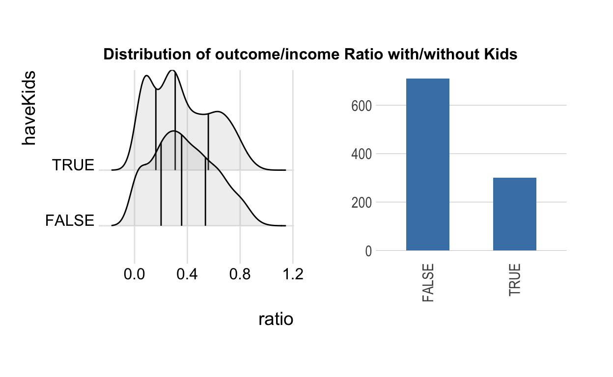
Another interesting found is that participants with kids tend to cut more expense than those without kids. And most of the participants are without kids, so the whole group tend to consume more frequently, which means the cash flow operates well and the finance is healthy.
Consumption Preference
Now, we can go deeper to find out the consumption preference of these groups of people given specific periods.
pie_data <- financial %>%
  merge(wage[,-2], by='participantId') %>%
  filter(!category %in% c('Wage', 'RentAdjustment')) %>%
  group_by(Wage_Group, category) %>%
  summarise(outcome = sum(-amount))
total_pie_data <- pie_data %>%
  group_by(Wage_Group) %>%
  summarise(total = sum(outcome))
pie_data <- merge(pie_data, total_pie_data, by='Wage_Group')
pie_data$ratio <- pie_data$outcome / pie_data$total

ggplot(data=pie_data, aes(x="", y=ratio, fill=category)) +
  geom_bar(width=1, stat="identity") +
  coord_polar("y", start=0) +
  facet_grid(~ Wage_Group) +
  theme(axis.title.x=element_blank(),
        axis.text.x=element_blank(),
        axis.ticks.x=element_blank(),
        axis.title.y=element_blank())
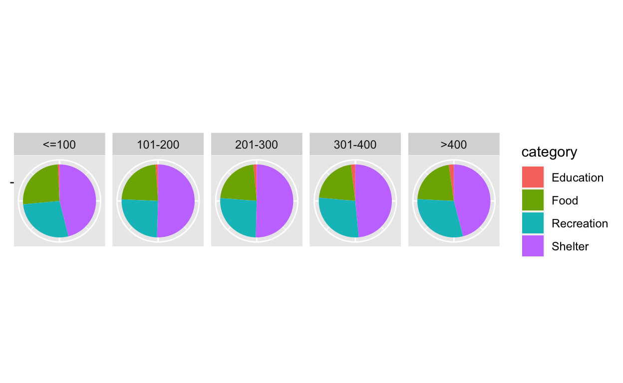
It is easy to find that food and shelter are major parts of the total consumption, and with the increase of wage, people will tend to spend more on recreation and education. In other words, high-income people are likely to pursue spiritual pleasure.
Constitution of Participants
wage_by_edu <- merge(participants[,c(1, 5)], wage, by='participantId')

p1 <- ggplot(data=wage_by_edu, aes(x= wage)) +
  geom_density() +
  ggtitle("Wage Distribution for different Education Level") +
  facet_grid(educationLevel~.) +
  theme(axis.text.x = element_text(angle = 90, hjust = 1, vjust = 0.5),
        axis.title.y = element_blank(), axis.title.x = element_blank())

edu_info <- wage_by_edu %>%
  group_by(educationLevel) %>%
  count()

p2 <- ggplot(data=edu_info, aes(x=educationLevel, y=n)) +
  geom_bar(stat = "identity", width = 0.5, fill="steelblue") +
  theme_ipsum(grid = "Y", axis_title_size = 14) +
  theme(axis.text.x = element_text(angle = 90, hjust = 1, vjust = 0.5),
        axis.title.y = element_blank(), axis.title.x = element_blank())

p1 | p2
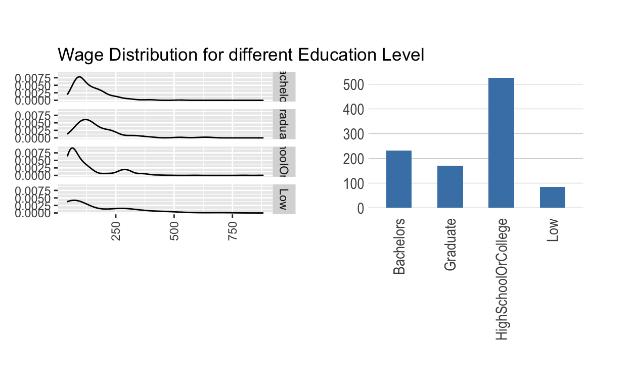
Combined with participants attributes, higher education level means higher income, and the participants are formed mainly by people with high school or college degree, which means the wage tend to be relatively high and stable. Therefore, the financial health is well.
This scatter plot shows that the age distribution of the participants is uniform, and no matter how old the participants are, the wage depends mainly on education instead of experience(age).